Visual Language
University Logo

The Hawai‘i Pacific University LOGO SIGNATURE is collectively defined as the sum of its two parts: the LOGO MARK and the
The logo must always be used in its entirety, without alteration.
Do not change its dimensions, colors, or proportions, and avoid cropping, stretching, or manipulating it in any way that compromises its readability or integrity.
University Logo Variations
Primary Logo
This is a full-color logo with a transparent background.

Download: PNG JPEG EPS (Vector)
Monochrome Logo
This is a white logo with a transparent background. (Teal below is for display purposes.)

Download: Large Medium EPS (Vector)
Word Mark - full color
Used when vertical space is limited. This is a full-color logo with a transparent background.
![]()
Download: PNG JPEG Illustrator (Vector)
Word Mark - monochrome
Used when vertical space is limited. This is a white logo with a transparent background. (Teal below is for display purposes.)
![]()
Download: PNG Illustrator (Vector)
Values logo - full color
Alternate version of the logo, highlighting HPU's core values. This is a full-color logo with a transparent background.

Values logo - monochrome
Alternate version of the logo, highlighting HPU's core values. This is a white logo with a transparent background. (Teal below is for display purposes.)

University Seal
The University Seal
The seal is used for administrative purposes only – such as diplomas and certificates.

Athletics logo
Inspired by the impact of the Pacific on our culture and lifestyle and by the traditional Hawaiian ‘aumakua (family god), the shark symbolizes HPU’s focus and purpose, strength and balance. The Athletics Logo demonstrates the university’s sense of Hawai‘i pride and its place in the Pacific.

Color Palette
We possess a unique and comprehensive collection of colors for visually expressing our brand. This chart provides a complete list of approved primary and secondary colors, along with each color’s specific numeric values.
- Print colors (process/CMYK and Pantone/PMS)
- On-screen color modes (RGB and Hexidecimal)
For Adobe Swatch Exchange files containing numeric values in CMYK, PMS, and RGB, please contact marcomm@hpu.edu.
Primary Brand Colors
HPU Teal
Pantone 7468
C:90 M:18 Y:7 K:29
R:0 G:113 B:153
#007298
HPU Lt Teal
Pantone 7458
C:55 M:12 Y:15 K:0
R:113 G:177 B:200
#71B1C8
Black
C:0 M:0 Y:0 K:100
R:35 G:31 B:32
#000000
White
C:0 M:0 Y:0 K:0
R:255 G:255 B:255
#ffffff
Secondary Brand Colors
The secondary colors should be used sparingly as accents, making up 1-5% of your design's overall color palette. These colors are ideal for drawing attention to specific details, such as key information or focal points, enhancing the design's visual hierarchy and impact.
HPU Logo-Gray
Pantone 5405
C:68 M:35 Y:17 K:40
R:79 G:117 B:139
#4f758b
HPU Ocean Blue
Pantone 660
C:77 M:47 Y:0 K:0
R:57 G:125 B:201
#397dc9
HPU Dark Blue
Pantone 295
C:100 M:83 Y:36 K:40
R:0 G:40 B:86
#002856
HPU Warm Sun
Pantone 123
C:0 M:17 Y:89 K:0
R:255 G:199 B:44
#ffc72c
HPU New Leaf Green
Pantone 380
C:5 M: 0 Y:71 K:11
R:219 G:228 B:66
#dbe442
HPU Sunset
Pantone P 20-8
C:0 M:40 Y:88 K:3
R:247 G:148 B:29
#f7941d
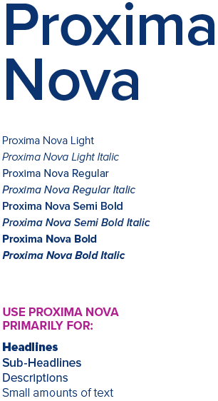
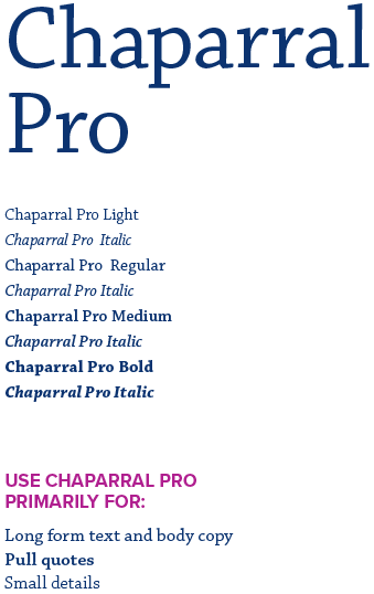
Typography
Our typography is how we visualize the University’s voice. Consistent use is absolutely critical in creating, maintaining, and expanding our brand’s impact, relevance, and reach.


